Getting Started
Introducing
Welcome to the documentation for Flavory, a bold, vibrant, and high-converting Shopify theme crafted specifically for food, snack, and flavor-focused brands.
Flavory features dynamic sections with multiple layout options, eye-catching animations, wavy borders, and interactive elements like quick reels, product bundles, and scrolling marquees—allowing you to create a flavorful, engaging storefront without any coding.
Upon installation, the theme includes pre-configured sections, blocks, and settings optimized for food & beverage stores, drawing from best practices in conversion-focused design to help you launch a delicious, high-performing online shop quickly.
This documentation is designed for everyone:
- If you’re new to Shopify, you’ll get clear, step-by-step instructions on key settings to get your store live fast.
- If you’re ready to customize, we cover every section, block, and setting in detail.
Flavory is intuitive and fun to use, with minimal setup required. But if you ever need assistance, our support team is here to help.
Installing the Theme
- Main Steps for Installing the Theme
Option 1: Install via Shopify Theme Store- Log in to your Shopify Admin.
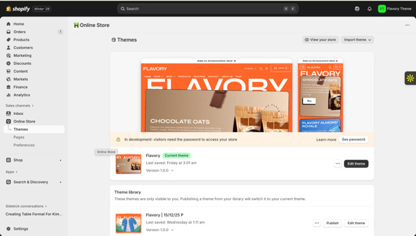
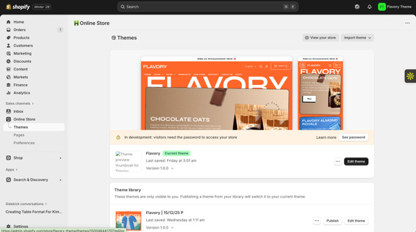
- Go to Online Store > Themes.
- Scroll to the Theme library section.
- Click Visit Theme Store.
- Search for Flavory.
- Click Add theme (or Try theme if available).
- The theme will appear in your Theme library.
From there, you can preview or publish it as your live theme.
Option 2: Upload a Theme ZIP File- Go to Shopify Admin > Online Store > Themes.
- In the Theme library, click Add theme > Upload zip file.
- Select and upload the Flavory .zip file.
- Once uploaded, it will appear in your library.
You can now preview, customize, or publish the theme.
Updating the Theme
To keep Flavory running smoothly with the latest features, bug fixes, and improvements:
- In your Shopify Admin, go to Online Store > Themes.
- Find your published Flavory theme.
- If an update is available, you’ll see an Update button—click it to apply the latest version automatically.
- Always back up your current theme first (click Actions > Duplicate).
Updates preserve your customizations thanks to Shopify’s theme system.
Support
We’re committed to your success! If you run into issues or have questions:
- Submit a ticket via our support portal (link in your theme purchase email).
- Include your store URL, screenshots, and a clear description.
- Response time: Typically within 24-48 hours (business days).
Header
Header Group
Customizing the Header Group in Your Shopify Theme:
- Access the backend of your store and navigate to the “Online Store” section.
2. Within the “Online Store” section, locate and click on the “Themes” option.
A list of available themes for your store will be displayed after clicking on the “Themes” option.
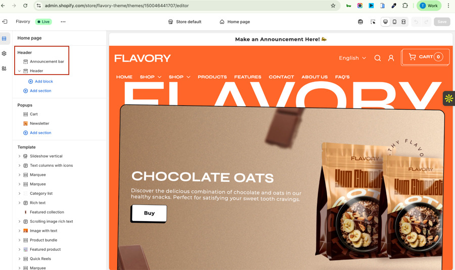
4. After clicking the “Customize” button, locate the “Header” option at the top left corner. This is where you can customize your chosen theme’s header section.
Announcement Bar
The Announcement Bar is a slim, site-wide bar that appears at the very top of your store (above the header). It’s perfect for displaying important messages like promotions, free shipping thresholds, new launches, holiday notices, or limited-time offers.
How to Add/Edit the Announcement Bar
- Go to Online Store > Themes > Customize.
- In the theme editor, select Header from the top dropdown (or click directly on the announcement bar area if visible).
- The Announcement Bar section will appear in the sidebar (it’s grouped under the Header group).
- Customize the settings below and watch changes live.
Settings
Color Scheme
- Choose a predefined color scheme for the bar background, text, and gradient.
- Options inherit from your theme’s global color schemes (e.g., orange accent, dark, light).
- Tip: Use a contrasting scheme (e.g., dark text on bright background) for maximum visibility.
Content
- This is the text/message displayed in the bar.
- Supports rich text formatting: bold, italic, links, and basic HTML.
Header
The Header is the top navigation bar of your store, containing your logo, main menu, search icon, customer account link, and cart. It’s fully customizable, supports sticky behavior, transparent mode for the homepage, mega menus, dropdowns, localization selectors (country/language), and app blocks. Flavory’s header is responsive and optimized for both desktop and mobile experiences.
How to Add/Edit the Header
- Go to Online Store > Themes > Customize.
- In the theme editor, select Header from the top dropdown menu (or any page – the header is global).
- The Header section settings will appear in the sidebar.
- Make changes and preview live on desktop/mobile.
The header cannot be removed entirely (as it’s essential), but you can hide elements like the menu or localization selectors.
Settings
Layout & Behavior
- Expanded width: Enable to make the header full-width (ignores page padding).
- Sticky header: Keeps the header fixed at the top while scrolling.
- Show line separator: Adds a bottom border for visual separation.
- Transparent header: Makes the header transparent on the homepage (great with hero banners). Requires a transparent logo.
Colors
- Color scheme: Main background/text colors for the header.
- Transparent color scheme: Separate scheme applied when transparent mode is active on the homepage.
Logo
- Logo image: Upload your primary logo (recommended 300–600px wide, PNG with transparent background).
- Transparent logo: Optional alternate logo for transparent header mode (e.g., white version on dark banners).
- Logo width (desktop): Adjust from 150–300px.
- Logo width (mobile): Adjust from 50–150px (scales automatically).
- Tip: If no logo is uploaded, the store name appears as text.
Navigation
- Menu: Select your main navigation menu (created in Navigation admin). Default: “Main menu”.
- Menu position:
- Menu left: Logo left, menu centered/right.
- Menu center: Classic centered menu below logo.
- Menu bottom-left (recommended): Inline menu below logo, ideal for mega menus.
- Desktop menu type (only when Menu bottom-left is selected):
- Dropdown: Simple dropdown submenus.
- Mega: Full-width mega menu with images, columns, and rich content.
- Show collection featured image in mega menu: Displays the collection image in mega menu panels (if set in menu items).
Localization
- Enable language selector: Shows language switcher (if multiple languages are active).
Enable country selector: Shows country/currency switcher (if multiple countries are active).
- Show country name: Displays country name next to flag/icon.
Section Spacing
- Padding top/bottom (desktop only): Controls vertical space inside the header (0–50px). Useful for taller logos or breathing room.
Icons & Features
- Search: Predictive search with popup/modal.
Account: Links to login or account page (if customer accounts enabled).
- Cart: Shows cart icon with item count bubble. Supports cart drawers.
- Localization forms: Country/language selectors appear on desktop (mobile in drawer).
Mobile Behavior
- Automatically collapses the menu into a drawer (hamburger icon).
- Search, account, and cart remain visible.
- Logo scales based on mobile width setting.
Templates
Vertical Slideshow
The Vertical Slideshow is a unique, modern hero section featuring a fixed logo (image or animated jumbo text) on the left/top, with vertically scrolling full-width slides on the right/bottom. It’s perfect for bold brand intros, product launches, or storytelling on the homepage. Up to 5 slides, each with optional borders, overlays, text, and buttons.
How to Add/Edit the Vertical Slideshow
- Go to Online Store > Themes > Customize.
- Select the page (usually Homepage).
- Click Add section > Vertical Slideshow.
- Customize global settings and add/edit slides (blocks).
Global Settings
- Color scheme: Background/text colors for the entire section.
- Use page background: Disable gradient for transparent/page background.
- Expanded width: Make section full-width (ignores page padding).
- Transparent header: Overlaps header for seamless hero effect (requires transparent logo in Header settings).
Aspect Ratio
- Desktop and mobile ratios (e.g., 16:9, 4:3). Adjust for taller/shorter slides.
Logo
- Logo image: Fixed logo displayed on left (desktop) or top (mobile).
- Logo width: 40–100% of available space.
- Bottom spacing: Fine-tune vertical position.
Jumbo Text Logo (if no image logo)
- Text: Custom text (e.g., “FLAVORY”).
- Case: Uppercase or default.
- Alignment: Left, center, right.
- Extra height: Add space for descenders (g, j, p, q, y).
Section Spacing
- Padding top/bottom (desktop/mobile halved on mobile).
Slide Settings (Blocks – Up to 5)
- Image: Desktop image (required).
- Mobile image: Optional separate mobile image.
- Image overlay opacity: Darken image for text readability.
Content
- Heading: Large heading text.
- Heading size: h3 to h0 (largest).
- Description: Rich text below heading.
- Button label/link: Primary button (style: primary/secondary).
- Make entire image clickable: Links whole slide if button empty.
- Content max width: 400–800px.
- Box alignment (desktop/mobile): 9 positions (top-left, middle-center, etc.).
- Color scheme: Per-slide colors.
Border
- Show border: Add frame around slide image.
- Style: Solid, dashed, dotted.
- Color: Custom border color.
Tips & Best Practices
- Use high-res images (min 1920px wide).
- First slide loads eagerly for performance.
- Pair with transparent header for immersive hero.
- Jumbo text animates character-by-character on load.
- Great for vertical storytelling (e.g., “From Farm to Flavor”)
Horizontal Slideshow
How to Add/Edit the Horizontal Slideshow
- Go to Online Store > Themes > Customize.
- Select the page (usually Homepage).
- Click Add section > Slideshow (or Horizontal Slideshow).
- Customize global settings and add/edit slides.
Global Settings
- Color scheme: Overall section colors.
- Use page background: Disable gradient.
- Expanded width: Full-width layout.
- Transparent header: Overlaps header (requires transparent logo).
- Wavy border: Add decorative wavy edges (top/bottom/both).
Slide Height
- Original (image ratio), small, medium, large.
Slider Behavior
- Auto-rotate: Enable/disable autoplay.
- Change speed: 3–9 seconds per slide.
Mobile
- Show text below image: Moves content under image on mobile.
Section Spacing
- Padding top/bottom (halved on mobile).
Slide Settings (Blocks – Up to 5)
- Image: Desktop image.
- Mobile image: Optional separate mobile version.
Overlay opacity & color: Darken/lighten image.
Content
- Subheading: Small text above heading.
- Heading: Main heading.
- Heading size: h3 to h0.
- Description: Rich text.
- Primary/Secondary buttons: Labels, links, styles (primary/secondary).
- Text alignment (desktop/mobile): Left, center, right.
- Box alignment: 9 positions (top-left to bottom-right).
- Show text box background: Enable semi-transparent box behind text.
- Color scheme: Per-slide colors.
- Make image clickable: If only primary button link set and no label.
Tips & Best Practices
- Arrows and dots appear automatically if >1 slide.
- First slide loads eagerly.
- Use wavy borders for playful separation.
- Dual buttons great for “Shop Now” + “Learn More”.
- Combine with transparent header for full-screen hero effect.
Both slideshows support transparent headers and high-performance image loading. Use Vertical for artistic/brand-focused intros and Horizontal for promotional carousels!
Text Columns with Icons
The Text Columns with Icons section is a flexible grid layout perfect for highlighting features, benefits, USPs (Unique Selling Points), services, or steps in a process. Display up to 8 columns with icons or custom images, titles, and descriptions. It supports both vertical (icon above text) and horizontal (icon beside text) layouts, making it ideal for trust-building areas like “Why Choose Us”, shipping info, or brand values.
How to Add/Edit Text Columns with Icons
- Go to Online Store > Themes > Customize.
- Select the page (e.g., Homepage, About Us).
- Click Add section > Text Columns with Icons.
- Customize global settings and add/edit columns (blocks) up to 8.
Global Settings
- Color scheme: Background and text colors.
- Use page background: Disable gradient for transparent/page background.
- Full width: Expand to full screen width (ignores page padding).
- Wavy border: Add decorative wavy edges (top, bottom, or both) when gradient is enabled.
Section Header
- Heading: Main title (supports rich text).
- Heading size: h4 to h1.
- Description: Optional rich text below heading.
- Heading alignment: Left, center, or right.
Layout
- Section view:
- Vertical view: Icon/image above title and text (best for mobile-first).
- Horizontal view: Icon/image beside text (compact, modern).
- Columns per row (desktop): 2–4 columns.
- Title size: h6 to h3 for column titles.
- Text alignment (desktop): Left, center, right (only in vertical view).
- Show border: Add subtle border around each column.
- Show box shadow: Add shadow to icon/image for depth.
Mobile
- Columns per row (mobile): 1 or 2.
- Mobile text alignment: Left, center, right.
Section Spacing
- Padding top/bottom (desktop; halved on mobile).
Column Settings (Blocks – Up to 8)
- Icon: Choose from 19 built-in theme icons (e.g., package, truck, lock, heart).
- Custom image: Upload your own image to replace the icon (recommended 200–400px square).
- Title: Column heading (supports rich text).
- Text: Description (rich text). Shown below title in vertical view; hidden in horizontal view (design choice for compactness).
Tips & Best Practices
- Use Cases:
- Free shipping, easy returns, secure checkout, fast delivery.
- Organic ingredients, no junk, bold flavors, sustainable sourcing.
- Steps like “Pick > Craft > Pack > Deliver”.
- Icons vs Images: Use icons for simplicity; custom images for branded or unique visuals (e.g., farm photos).
- Vertical vs Horizontal: Vertical is more mobile-friendly and spacious; horizontal saves vertical space.
- Animation: Columns fade/slide in on scroll (built-in).
- Performance: Optimize custom images (<100KB).
- Accessibility: Icons have fallbacks; always add meaningful titles.
This section is one of the most versatile in Flavory—use it multiple times per page for clear, scannable information that builds trust and drives conversions!
Marquee
The Marquee section creates a continuously scrolling text banner that repeats your messages across the screen. It’s ideal for highlighting promotions, announcements, USPs, taglines, or fun brand statements (e.g., “Free Shipping • Bold Flavors • Zero Junk”). The text scrolls smoothly, pauses on hover, and can be customized for speed, direction, and slight rotation for a dynamic effect.
How to Add/Edit the Marquee
- Go to Online Store > Themes > Customize.
- Select the page (commonly Homepage, above/below hero or in footer area).
- Click Add section > Marquee.
- Customize global settings and add/edit text blocks (up to 5).
The section only appears if at least one block has text.
Global Settings
- Expanded width: Make the marquee full-width (recommended for best visual impact).
- Color scheme: Background and text colors.
- Text size: From h6 (smallest) to h2 (largest).
Scrolling Behavior
- Scrolling speed: Slow (0.50), Medium (0.75), or Fast (1).
- Left to right: Reverse direction (default is right to left).
- Scroll rotate: Slightly tilt the entire marquee (-1°, 0°, or +1°) for a playful angled look.
Section Spacing
- Padding top/bottom: Internal space (halved on mobile).
- Margin top/bottom: Negative margins (-100 to 0px) to overlap with adjacent sections (great for placing over hero edges or footers).
Text Block Settings (Up to 5)
- Text: The message to display (e.g., “Free Shipping on Orders Over $50 ★”).
- Link (optional): Make the text clickable (e.g., link to a sale collection or shipping policy page).
Tips & Best Practices
- Content Ideas:
- Promotions: “20% Off Sitewide • Code: FLAVOR20 • Ends Soon”
- USPs: “Real Ingredients • Bold Flavors • Zero Junk • Organic Certified”
- Fun: “Crunch Louder • Sip Bolder • Snack Happier ★”
- Announcements: “New Flavors Dropped • Shop Now • Limited Stock”
- Styling: Use ★, •, or emojis as separators for visual pop. Repeat blocks for seamless looping.
- Direction: Right-to-left feels natural; reverse for a fresh look.
- Rotation: -1° or +1° adds energy without overwhelming.
- Hover Pause: Automatically pauses when hovered (great for clickable links).
- Placement: Works best as a thin strip between sections—use negative margins to overlap hero or footer for seamless design.
- Multiple Marquees: Add more than one on a page (e.g., top and bottom) with different speeds/messages.
The Marquee is lightweight, performant, and one of the most eye-catching ways to communicate key info to every visitor. Update it frequently for sales, launches, or seasonal messaging!
Category List
The Category List section displays a customizable grid of category cards, perfect for showcasing product categories, collections, or curated groups (e.g., Oats, Bars, Drinks, Chips, Ramen). Each card can feature an image, title, and link, with flexible sizing per card for desktop and mobile. Up to 8 cards supported.
How to Add/Edit the Category List
- Go to Online Store > Themes > Customize.
- Select the page (usually Homepage or collection pages).
- Click Add section > Category List.
- Customize global settings and add/edit category blocks (up to 8).
Global Settings
- Color scheme: Background and card colors.
- Full width: Expand to full screen (ignores page padding).
- Use page background: Disable gradient for transparent/page background.
- Wavy border: Add decorative wavy edges (top, bottom, or both) when gradient enabled.
Section Header
- Title: Main heading (supports rich text). Leave blank to hide text and show image instead.
- Heading size: h3 to h0 (largest).
- Description: Optional rich text below heading.
- Heading alignment: Left, center, right.
- Heading image: Alternative to text title – upload an image (e.g., branded banner). Only shows if title is blank.
Card Style
- Title size: h6 to h3 for category titles.
- Category image style:
- Left: Image left, title right (classic).
- Background: Image as full background with overlay text.
- Hide: Title only (no image).
- Background opacity (background style only): 0.1–0.9 for text readability.
- Block height: Small, medium, large (controls card height).
- Show box shadow: Add shadow on hover for depth.
- Show background color: Enable colored card background on hover.
Section Spacing
- Padding top/bottom (halved on mobile).
Category Block Settings (Up to 8)
- Color scheme: Per-card colors (overrides global).
- Container size (desktop): 20%, 25%, 33%, 50%, 75%, 80%, 100% – allows mixed grid layouts.
- Container size (mobile): 50% or 100%.
- Image: Card image (recommended 800–1200px wide). Falls back to placeholder if blank.
- Title: Category name (e.g., “Protein Oats”).
- Link: URL to collection, page, or external (e.g., /collections/oats).
Tips & Best Practices
- Layout Ideas:
- Mixed sizes: One large featured category (50–100%) + smaller ones.
- Equal grid: All 25% or 33% for clean look.
- Image Styles:
- “Background” great for bold, immersive visuals with overlay text.
- “Left” for traditional catalog feel.
- Use Cases:
- Shop by category on homepage.
- Flavor families (Sweet, Savory, Spicy).
- Curated bundles or new arrivals.
- Performance: First section images load with high priority.
- Animation: Cards fade/slide in on scroll.
- Hover Effects: Subtle shadow and background reveal for interactivity.
This section is highly flexible—use it to guide customers directly to their favorite categories and boost navigation!
Rich Text
The Rich Text section is a versatile, content-focused block for adding headings, subheadings, descriptive text, and up to two call-to-action buttons. It’s ideal for introductions, brand stories, promotional messages, or any centered content on the homepage, about page, or landing pages. Content is built using modular blocks for maximum flexibility.
How to Add/Edit the Rich Text Section
- Go to Online Store > Themes > Customize.
- Select the page (e.g., Homepage, About Us).
- Click Add section > Rich Text.
- Customize global settings and add/edit blocks (Heading, Text, Button).
Global Settings
- Expanded width: Make content full-width (recommended for hero-style messages).
- Use page background: Disable gradient for transparent/page background.
- Color scheme: Background and text/button colors.
- Alignment: Left, center (default), or right alignment for all content.
Section Spacing
- Padding top/bottom (halved on mobile).
Block Types
You can add up to:
- 3 Heading blocks
- 3 Text blocks
- 2 Button blocks
Order them as needed—blocks stack vertically.
Heading Block
- Subheading: Small text above main heading (e.g., “Welcome to Flavory”).
- Heading: Main large heading (supports rich text formatting).
- Heading size: h3 to h0 (largest for maximum impact).
Text Block
- Text: Rich text editor for paragraphs, lists, links, or bold/italic formatting.
Button Block
- Primary button:
- Label (e.g., “Shop Now”)
- Link (collection, page, or external URL)
- Style: Primary (bold) or Secondary (outline)
- Secondary button (optional): Same options as primary.
- Buttons display side-by-side if both are filled.
Tips & Best Practices
- Common Uses:
- Hero messages: Large heading + description + “Shop All” button.
- Brand story intros: Subheading + heading + paragraph.
- Promotions: “Limited Time Offer” + text + dual buttons (“Shop Sale” + “Learn More”).
- Styling: Content animates in on scroll (fade/slide cascade).
- Buttons: Use contrasting styles (primary + secondary) for clear hierarchy.
- Mobile: Text scales beautifully; buttons stack vertically if needed.
- Placement: Works great below slideshows, above featured collections, or on About/Contact pages.
The Rich Text section gives you full control over simple, elegant, text-driven content—perfect for storytelling and conversions without needing images!
Featured Collection
The Featured Collection section showcases a selection of products from a chosen collection in a responsive grid or slider layout. It’s perfect for highlighting best-sellers, new arrivals, seasonal picks, or themed groups (e.g., “Protein Boosters”, “Spicy Favorites”). Supports quick add-to-cart, secondary image on hover, and a “View All” button when there are more products in the collection.
How to Add/Edit the Featured Collection
- Go to Online Store > Themes > Customize.
- Select the page (usually Homepage).
- Click Add section > Featured Collection.
- Choose a collection and customize display options.
Global Settings
- Color scheme: Background and product card colors.
- Full width: Expand to full screen width.
- Use page background: Disable gradient for transparent/page background.
- Wavy border: Add decorative wavy edges (top, bottom, or both) when gradient enabled.
Section Header
- Title: Main heading (e.g., “Best Sellers”).
- Heading size: h3 to h0 (largest).
- Sub-heading: Optional smaller text below title.
- Heading alignment: Left, center (default), right.
Collection & Products
- Collection: Select the collection to feature.
- Products to show: 2–25 (limits displayed products).
- Desktop products per row: 1–4 columns.
- Image ratio: Original, portrait, or square (controls card image height).
Slider
- Enable slider: Turns grid into swipeable carousel with arrows (auto-enables on mobile).
Card Features
- Show secondary image: Display alternate image on hover (if set on product).
- Show vendor: Display brand/vendor name.
- Enable quick add: Show “Quick Add” button for fast variant selection and cart add.
- Show box shadow: Add shadow on hover for depth.
- Text alignment: Left, center, right (only when quick add is disabled).
View All
- Show View All: Displays a “View All” link below title when there are more products in the collection than shown.
Mobile
- Products per row (mobile): 1 or 2 columns.
Section Spacing
- Padding top/bottom (halved on mobile).
Tips & Best Practices
- Use Cases:
- Homepage: “New Arrivals”, “Top Picks”, “On Sale”.
- Landing pages: Curated bundles like “Post-Workout Essentials”.
- Slider vs Grid: Enable slider for many products; disable for clean static grid.
- Quick Add: Great for simple products (one variant) – boosts conversions.
- Performance: Products load efficiently; first section prioritizes images.
- “View All” Button: Automatically appears if collection has more items than displayed.
- Styling: Cards match your global product card design (badges, ratings via apps).
- Empty Collection: Falls back to placeholder cards in editor for easy setup.
This section is one of the most powerful for driving sales—place it prominently to turn visitors into buyers!
Scrolling Image with Rich Text
The Scrolling Image with Rich Text section combines centered rich text (subheading, heading, description, and buttons) with floating, positioned images that appear to “scroll” behind the text as the user moves down the page. Up to 15 images can be added and precisely positioned for a dynamic, layered visual effect—perfect for storytelling, brand messages, or creative hero sections.
How to Add/Edit Scrolling Image with Rich Text
- Go to Online Store > Themes > Customize.
- Select the page (usually Homepage).
- Click Add section > Scrolling Image with Rich Text.
- Customize text/buttons globally, then add/edit image blocks.
Global Settings
- Color scheme: Background and text colors.
- Use page background: Disable gradient for transparent/page background.
- Expanded width: Make section full-width.
- Wavy border: Add decorative wavy edges (top, bottom, or both).
Text Content
- Subheading: Small text above heading.
- Heading: Main large heading (supports rich text).
- Heading size: h3 to h0 (largest).
- Text: Rich text description.
- Primary/Secondary buttons: Labels, links, styles (primary/secondary).
Section Spacing
- Padding top/bottom (halved on mobile).
Image Block Settings (Up to 15)
- Image: Upload the floating image (recommended 400–800px).
- Image width: 10–30% of section width.
- Horizontal position: 0–100% from left (controls left/right placement).
- Vertical position: 0–100% from top (controls up/down placement).
Tips & Best Practices
- Design Effect: Images are absolutely positioned with shadow/border for depth. They create a parallax-like feel as users scroll.
- Positioning: Use low horizontal/vertical for top-left, high for bottom-right. Overlap creatively.
- Use Cases:
- Brand stories: “Our Journey” with floating product/ingredient photos.
- Creative promos: Text over scattered flavor images.
- Mobile: Images scale down; test positioning.
- Performance: Lazy-loaded images.
- Animation: Text fades/slides in on scroll.
Image with Text
The Image with Text section displays a single image alongside rich text content (subheading, heading, text, button) in a two-column layout. Ideal for feature highlights, about sections, or promotional blocks. Image can be left or right; content alignment is fully customizable.
How to Add/Edit Image with Text
- Go to Online Store > Themes > Customize.
- Select the page.
- Click Add section > Image with Text.
- Customize image, layout, and add blocks (heading, text, button).
Global Settings
- Color scheme: Background colors.
- Use page background: Disable gradient.
- Full width: Expand to full screen.
- Wavy border: Add wavy edges.
Image
- Image: Main image (recommended 800–1500px wide).
- Height: Original (image ratio), small, medium, large.
- Image position right: Swap image to right side (text left).
Content Position
- Desktop content position: Top, middle (default), bottom.
- Desktop/mobile content alignment: Left, center, right.
Section Spacing
- Padding top/bottom.
Block Types (One of each)
- Heading: Subheading + main heading + size.
- Text: Rich text description.
- Button: Label, link, style, custom color scheme.
Tips & Best Practices
- Layout: Classic alternating sections—switch image side for variety.
- Use Cases: “Our Story”, “Why Organic?”, “Free Shipping Details”.
- Mobile: Stacks image above text; alignment adjusts.
- Button: Use contrasting style for visibility.
Product Bundle (Limited Edition Products)
The Product Bundle section lets customers build their own bundle by selecting 2–3 products, then adding them all to cart with one click. Features rotating badges, custom backgrounds, and swipeable layout—great for “Build Your Own Pack” or limited-edition promotions.
How to Add/Edit Product Bundle
- Go to Online Store > Themes > Customize.
- Click Add section > Product Bundle.
- Customize heading/button, then add up to 3 product blocks.
Global Settings
- Color scheme: Background.
- Use page background: Disable gradient.
- Expanded width: Full-width layout.
- Show box shadow: On product cards.
- Wavy border: Decorative edges.
Header
- Title/Heading size/Sub-heading: Centered/left/right aligned.
- Button label/style: Text for final “Add to Cart” button.
Section Spacing
- Padding top/bottom.
Product Block Settings (Up to 3)
- Product: Select the product.
- Custom product image: Override default.
- Background image: Decorative backdrop.
- Scrolling background color: Gradient for card.
- Rotating image/badge: Floating badge image.
- Badge width: 70–170px.
Tips & Best Practices
- Functionality: Customers check boxes → “Add Selected to Cart” (min 2, max 3). Sold-out products disabled.
- Visuals: Rotating badge + gradient background create premium feel.
- Use Cases: “Mix & Match”, “Limited Edition Trio”, “Build Your Flavor Pack”.
- Mobile: Swipeable carousel.
- Placement: High-conversion on homepage or collection pages.
These sections add creative flair and interactivity—Scrolling Image for artistry, Image with Text for simplicity, and Product Bundle for sales boosts!
Featured Product
The Featured Product section showcases a single product in a detailed, visually rich layout with media gallery, product information, variant picker, buy buttons, and customizable blocks like collapsible tabs, inventory status, and more. It’s ideal for highlighting a hero product, new arrival, or limited-edition item on the homepage or dedicated landing pages.
How to Add/Edit the Featured Product
- Go to Online Store > Themes > Customize.
- Select the page (usually Homepage).
- Click Add section > Featured Product.
- Select a product and customize layout/blocks.
Global Settings
- Expanded width: Full-width layout.
- Color scheme: Background and text colors.
- Use page background: Disable gradient.
- Wavy border: Decorative wavy edges (top/bottom/both).
Section Header
- Title/Heading size/Sub-heading: Optional heading above product.
- Content alignment: Left/center/right.
Product
- Product: Choose the product to feature.
Media Gallery
- Gallery layout: Stacked, horizontal slider, or vertical slider.
- Image ratio: Adapt, portrait, square (for non-stacked).
- Show thumbnail: Display thumbnails below gallery (non-stacked).
- Show box shadow: On media items.
- Enable video looping: Loop videos in gallery.
Mobile
- Image ratio (adapt mobile): When using adapt ratio.
Section Spacing
- Padding top/bottom.
Blocks (Customizable Order)
- @app: Embed app blocks.
- Vendor: Show product vendor.
- Title: Product title (custom size).
- Content: Full product description.
- Price: Price with compare-at, badges.
- SKU: Display variant SKU.
- Inventory: Stock status with custom messages.
- Variant Picker: Dropdown or buttons.
- Buy Buttons: Add to cart, dynamic checkout, payment icons.
- Share: Social share buttons.
- Discount: Custom discount code copier.
- Custom Liquid: Insert custom code.
- Rating: Star rating from metafields.
- Icon with Text: Up to 4 icon/text steps (e.g., “Free Shipping”).
- Collapsible Tab: Up to 4 tabs (description + custom/page content).
Tips & Best Practices
- Layout: Vertical slider pairs well with transparent header for immersive hero.
- Collapsible Tabs: Great for detailed info (ingredients, shipping).
- Quick Add/Buy: Drives conversions—enable dynamic checkout.
- 3D Models: Supports Shopify model viewer if product has 3D media.
- Fallbacks: Placeholders shown in editor if no product selected.
- View Details Link: Always links to full product page.
This section is perfect for creating a mini product page experience anywhere!
Quick Reels
The Quick Purchase section shows products in a scrolling marquee or detailed view for instant buying. Style 1: Simple scrolling list; Style 2: Click to reveal full card. Encourages impulse buys.
How to Add/Edit Quick Purchase
- Go to Online Store > Themes > Customize.
- Click Add section > Quick Purchase.
- Customize and add up to 15 products.
Global Settings
- Color scheme: Background.
- Use page background: Transparent.
- Expanded width: Full-width.
- Show box shadow: On cards.
- Wavy border: Edges.
Header
- Title/Heading size/Sub-heading: Aligned.
Container
- Style: Style 1 (compact scrolling) or Style 2 (click to expand).
- Quick purchase scheme: Card colors.
- Background image: Decorative.
- Quick purchase title/Title size: Overlay heading.
- Search product shadow: On expanded cards (Style 2).
Button
- Label/Style: Final add-to-cart button.
Section Spacing
- Padding top/bottom.
Product Block Settings
- Product: Select product.
- Custom product image: Override default.
Tips & Best Practices
- Style 1: Fast scrolling—great for “Grab Quick” vibe.
- Style 2: Interactive reveal—shows full card on click.
- Use Cases: “Best Sellers”, “Flash Deals”, “Snack Essentials”.
- Mobile: Fully swipeable.
Testimonials
The Testimonials section displays customer quotes in auto-scrolling marquee or manual slider. Includes author name, designation, and logo for credibility.
How to Add/Edit Testimonials
- Go to Online Store > Themes > Customize.
- Click Add section > Testimonials.
- Customize and add up to 15 blocks.
Global Settings
- Color scheme: Background.
- Use page background: Transparent.
- Full width: Expand.
- Wavy border: Edges.
Header
- Heading/Heading size/Paragraph: Centered/left/right.
Slider
- Slider type: Auto (marquee) or Manual.
- Marquee speed/Card width (desktop/mobile): Auto only.
- Desktop slide: Manual only.
Section Spacing
- Padding top/bottom.
Block Settings
- Text: Quote.
- Paragraph: Additional content.
- Author name/Designation: Details.
- Logo: Company/customer logo.
Tips & Best Practices
- Auto: Endless scroll for passive social proof.
- Manual: Controlled viewing with arrows.
- Use Cases: Customer reviews, partner quotes.
Image with Highlight
The Image with Highlight section features a central image with up to 4 floating highlight cards (text + button) positioned around it. Desktop: Overlapping layout; Mobile: Stacked. Great for “From Bean to Bar” style storytelling.
How to Add/Edit Image with Highlight
- Go to Online Store > Themes > Customize.
- Click Add section > Image with Highlight.
- Customize header and add up to 4 highlight blocks.
Global Settings
- Color scheme: Background.
- Use page background: Transparent.
- Full width: Expand.
- Show box shadow: On highlight cards.
- Wavy border: Edges.
Header
- Title/Heading size/Sub-heading: Aligned.
Section Spacing
- Padding top/bottom.
Highlight Block Settings
- Image: Central/floating image.
- Heading/Description/Button: Card content.
- Hover effect: Rotate image on hover.
Tips & Best Practices
- Layout: Images overlap with negative margins for depth.
- Positioning: Fixed order (1 top-left, 2 top-right, 3 bottom-left, 4 bottom-right).
- Use Cases: Process steps, ingredient highlights, “Why Us”.
- Mobile: Clean stacked layout.
These sections complete Flavory’s dynamic, engaging toolkit—perfect for bold, flavorful storytelling and conversions!
Video
The Video section displays a single embedded video (YouTube, Vimeo, or uploaded MP4) with customizable aspect ratio, autoplay, controls, and cover image. Text overlay includes heading and subheading. Perfect for brand intros, tutorials, or promotional videos.
How to Add/Edit the Video Section
- Go to Online Store > Themes > Customize.
- Select the page (usually Homepage).
- Click Add section > Video.
- Choose video source and customize.
Global Settings
- Color scheme: Background/text colors.
- Use page background: Disable gradient.
- Expanded width: Full-width (default) or custom max-width (700–1400px).
- Show box shadow: On video player.
- Wavy border: Decorative edges.
Text
- Heading/Heading size: Main text overlay.
- Subheading: Smaller text below.
- Alignment: Left, center (default), right.
Video
- Video type: URL (YouTube/Vimeo) or uploaded.
- Cover image: Poster frame (recommended).
- Autoplay: Muted autoplay on load.
- Show controls: Display player controls.
- Desktop/Mobile ratio: Adapt (original), portrait (4:5), square, landscape (16:9).
- Media fit: Cover (crop) or contain (letterbox).
Section Spacing
- Padding top/bottom.
Tips & Best Practices
- Autoplay: Works best muted (required for most browsers).
- Ratio: Landscape for cinematic; portrait for mobile-first.
- Cover: Always add attractive poster for instant visual appeal.
- Use Cases: “Meet the Founder”, “How It’s Made”, “Flavor Spotlight”.
- Mobile: Responsive with separate ratio option.
FAQ
The FAQ section features collapsible accordion-style questions and answers with optional background shape and CTA button. Up to 12 FAQs.
How to Add/Edit FAQ
- Go to Online Store > Themes > Customize.
- Click Add section > FAQ.
- Add FAQ blocks (up to 12).
Global Settings
- Color scheme: Background.
- Use page background: Transparent.
- Expanded width: Full-width.
- Show box shadow: On accordion items.
- Wavy border: Edges.
Header
- Title/Heading size/Sub-heading: Aligned.
Background Shape
- Show background shape: Decorative colored overlay.
- Background shape color: Custom color.
Button
- Label/Link/Style: Optional CTA below FAQs.
Section Spacing
- Padding top/bottom.
FAQ Block Settings
- Heading: Question.
- Description: Rich text answer.
Tips & Best Practices
- Use Cases: Shipping, returns, ingredients, sizing.
- First 5: Auto-open height for smooth scroll.
- Button: Link to full FAQ page or contact.
Logo List
The Logo List section displays partner/press logos in auto-scrolling marquee or manual slider. Supports links and custom ratios.
How to Add/Edit Logo List
- Go to Online Store > Themes > Customize.
- Click Add section > Logo List.
- Add up to 15 logo blocks.
Global Settings
- Color scheme: Background.
- Use page background: Transparent.
- Full width: Recommended.
- Wavy border: Edges.
Header
- Title/Heading size/Sub-heading: Aligned.
Logos
- Logo width: 50–80% of card.
- Image ratio: Original, portrait, square.
- Show box border/shadow: On cards.
Slider
- Slider type: Auto (marquee) or Manual (arrows).
- Logos per row (manual): 4–8 desktop, 1–2 mobile.
- Marquee speed/Card width: Auto only.
Section Spacing
- Padding top/bottom.
Logo Block Settings
- Image: Logo (transparent PNG best).
- Link: Optional URL.
Tips & Best Practices
- Use Cases: “As seen in”, partners, certifications.
- Auto: Seamless scroll for credibility.
Countdown Clock
The Countdown Clock section builds urgency with a timer, heading, sale image, and buttons (including discount code copier).
How to Add/Edit Countdown Clock
- Go to Online Store > Themes > Customize.
- Click Add section > Countdown Clock.
- Set date/time and customize blocks.
Global Settings
- Color scheme: Background.
- Use page background: Transparent.
- Show container border: Around content.
- Wavy border: Edges.
- Background image: Full-section image.
Section Spacing
- Padding top/bottom.
Blocks (One of each)
- Content: Heading + optional sale image.
- Clock: Set year/month/day/hour/minute; optional hide clock + completion message.
- Button: Primary CTA + optional discount code button (copy to clipboard).
Tips & Best Practices
- Urgency: Perfect for flash sales, launches.
- Discount: Code copier increases conversions.
- Image: Bold sale graphic.
Newsletter
The Newsletter section encourages email signups with heading, paragraph, form, background image, and optional rotating badge.
How to Add/Edit Newsletter
- Go to Online Store > Themes > Customize.
- Click Add section > Newsletter.
- Customize content and add blocks.
Global Settings
- Color scheme: Background/text.
- Use page background: Transparent.
- Expanded width: Full-width.
- Wavy border: Edges.
- Background image: Full overlay.
- Show background image: Toggle.
- Text alignment: Left/center/right.
Section Spacing
- Padding top/bottom.
Blocks
- Heading: Large text.
- Paragraph: Description.
- Email form: Shopify signup form.
- Rotating badge: Floating image (max 1).
Tips & Best Practices
- Incentives: “Get 10% off your first order”.
- Badge: “Limited Offer” or icon.
Main Blog
The Main Blog section displays blog posts in a grid with pagination, custom columns, and card options.
How to Add/Edit Main Blog
Automatically used on blog template; can add as section elsewhere.
Settings
- Full width: Expand.
- Use page background: Transparent.
- Color scheme: Background + card scheme.
- Posts per row: 1–3 desktop.
- Post limit: 3–8 per page.
- Image ratio: Original/portrait/square.
- Show hover animation/tag/date/author.
Section Spacing
- Padding top/bottom.
Tips & Best Practices
- Content Marketing: Recipes, tips, behind-the-scenes.
- SEO: Drives traffic and engagement.
These final sections round out Flavory’s bold, conversion-focused design—perfect for engagement, urgency, and trust-building!
Footer
Footer
The Footer is a fully customizable bottom section featuring logo, menu columns, newsletter signup, social links, payment icons, localization selectors, policies, and copyright. It adapts beautifully across devices with optional mobile accordion menus and wavy top border.
Key Features
- Logo: Optional footer logo (different from header).
- Menu Columns: Up to 6 blocks (typically 3–4 link lists + text block).
- Newsletter: Prominent signup form with heading and description.
- Social Media: Icons with optional introductory text.
- Localization: Country and language selectors (if multiple available).
- Payment Icons: Auto-displays enabled payment methods.
- Policies: Links to privacy, terms, refund, shipping policies.
- Copyright: Shop name + year + custom text + optional “Powered by Shopify”.
- Follow on Shop: Shopify’s follow button (if enabled).
Layout & Design
- Expanded width: Full-width (default) or contained.
- Color scheme: Independent background/text colors.
- Use page background: Transparent for seamless blending.
- Wavy border: Decorative top wave when gradient enabled.
- Mobile accordion: Collapsible menu columns for clean mobile experience (enabled by default).
Newsletter
- Separate color scheme for visual separation.
- Text alignment: Left, center, right.
Spacing
- Padding top/bottom (halved on mobile).
Block Types (Up to 6)
- Link List: Menu with heading and links (e.g., “Quick Links”, “Customer Care”).
- Text: Custom rich text + optional image (e.g., about blurb, contact info).
- @app: Embed third-party app blocks.
Tips & Best Practices
- Standard Setup:
- Logo + 3–4 link lists (Shop, Info, Support, Legal) + Newsletter.
- Branding: Use secondary logo (white version) on dark footer.
- Newsletter: Strong incentive copy (“Join for 10% off”) boosts signups.
- Mobile: Accordion keeps footer compact—highly recommended.
- Legal: Always show policy links for trust and compliance.
- Social: Add text like “Follow our flavor journey” for personality.
The Footer ties the entire Flavory experience together—professional, trustworthy, and on-brand. Update menus and newsletter copy seasonally for freshness!